Sunday, November 30, 2008
Humor and Function
This is how I am satisfied looking at other people being entertained and happy. And as an industrial designer I would like to carry out this throughout my career. I would like to bring humor to people however this humor is not just “funny” but an emotional experience that would not be forgotten. I often do this with form, color, material, or theme. To set a theme I often create a mood board so I can get a general theme for my final design.
This mood board was created during second semester design principles. Our project was to create a packaging for fruit for a specific user group. I chose “kids” for my user group. However the teachers did not tell us that we were going to create a packaging. They only told us to make a mood board using that user group. So I created a my mood board as if it were a game. “Tommy Pacman” was the game name. Right in the center was Tommy and the Pacman goes along and eats all the candy, chocolate, toys, sporting goods, and etc. (all things that a kid might like) and goes back to Tommy. As the Pacman eats all the “goodies” Tommy’s imagination, influence, nutrition, physical activity, and education points go up. (located on the lower part of the board). This mood board really helped develop my final product and everyone seemed to like it. The most comments I got from my final product was that “it’s fun!”
However, I don’t want to create things that are wasteful and harmful for the world. I am interested in humanitarian design where there is the most potential for the need of humor. I think humor is the best thing that can let the people forget about poverty, at least for awhile. But it seems to be difficult to mingle humor and function together. Function can be something simple, easy to make, and cost efficient. However, humor in design sometimes can be the opposite of function. It can be complex, difficulty in manufacturing, and expensive. Can these two factors work together? Is that an answer that the designer should find out? If these two factors go together then I think this world could be a better place.
Sunday, November 23, 2008
collaboration, customization, and EXPERIENCE
Sunday, November 16, 2008
The World Bike and “Out of Gas” Studio
Web Source: http://www.worldbike.org/
Sunday, November 9, 2008
My Reflection on Humanitarian Design
Most designers, including myself, think of profit or mass production when they design. That is normally what we are taught and also that is what people want. However, deep inside, Just like any other design student, my dream is simple. It is to bring humor to the world with my design solutions. This dream, however, goes along with how much money I earn and how famous I get during my career. I want to be rich and famous. I was thinking about this my whole life until I heard about humanitarian design.
When I thought of humanitarian design the first thing that came up to my mind is that it is boring, because all we can do is create something purely functional. Form studies or material exploration are all unnecessary aspects to think about. No extra money for the esthetics is needed. In humanitarian design it is just purely about function. This is what I had in mind about the subject of humanitarian design half way up to Dr. Becker’s lecture. However, as he said “what do you think you need if all of you guys were locked in this room for a long period of time?”my mind began to move. I suddenly thought about how painful it will be to be locked in a room with many people, no ventilation or air conditioning, food and water. Honestly speaking, it is already somewhat painful to be in that room during lectures.
It kept me thinking. It made me think of my dream of bringing humor to people in the world. Those people also include the people who are in third world countries and refugee camps. They also have the right to enjoy what designers, including myself, come up with. This lecture helped my perspective as a designer change. It is not about the money or fame that we get being a great designer, but it is how well you satisfy people with your design. Earning money and fame should not be an issue as a designer. Satisfying people and bringing them hope and joy should be a designer’s top priority. If that idea is set in your roots as a designer, then I think money and fame should follow automatically.
Sunday, November 2, 2008
DYSON: A New User Group
A great example of reversing gender roles in product users can be Dyson’s vacuum cleaners. Dyson became famous not only because they came up with an idea of a vacuum cleaner without dust bags, but because the “look” of their product as well. Before the Dyson vacuum cleaners were out, vacuum cleaners that were used in homes were designed specifically for female users since they were the ones who used the vacuum cleaner at homes. They all were somewhat organically designed with elegant contours and non-aggressive forms. However, Dyson’s vacuum cleaners were different in their “look.”
Dyson came up with a whole new “look.”This “look” immediately gave meaning to the Dyson vacuum cleaner. They chose strong and aggressive form language that quickly attracted male users. Because of this, many male users were striving to buy this newly released product and were quickly obsessed with this product like they were obsessed with power tools (which power tools have similar form languages). Also, due to social changes where now the father and mother both work as well as do house chores, many male users started to be more comfortable in helping their wives vacuuming the house just because they wanted to take the chance of using the “cool-looking” Dyson vacuum cleaner.
As Dyson came up with the male appealing design of a vacuum cleaner they had succeeded tremendously in the market. However, this success was possible because Dyson had noticed there was a social change happening in many households. That social change was that female users weren’t the only ones who use vacuum cleaners. Due to the fact that in many households the husband and the wife both go out to work they would divide house chores evenly as well. That makes the husband a common user of a vacuum cleaner. Dyson caught this social change and evolved its design based on it. After Dyson had succeeded many companies started to manufacture similar products that were much cheaper than the Dyson. I personally own the cheaper version from a company named Eureka. The design is not perfectly the same; however, the form language of the Dyson vacuum cleaner remains the same.
Saturday, October 25, 2008
My Design Philosophy
To start out with the first element of my design philosophy, every design should be different. In the world of design there are so many different designs that rapidly appear in the market. To be successful over all of those designs you have to come up with something even more different than those designs out in the market. Many design teachers often say think out of the box, and I agree with that phrase. To think out of the box, I tend to throw out extreme ideas during the early stage of my design process. Most of the time people tend to laugh and go when they see these ideas that I throw out, but sometimes these ideas get rewarded because someone comes up and says “that can work.” This happened during my internship over this summer.
During this summer, I worked with the OLED display department in Samsung back in Korea. They wanted me to develop ideas that they can apply to this newly developed technology: OLED. I started to throw out extreme idea as usual and presented the ideas to the department. At first they laughed, and then someone started to point out few designs and said it can be possible. This started out a whole new conversation in the meeting room with the subject of possible vs. impossible. At the end, the department decided that it was possible and they got a patent for the designs. For me, it was exciting because my design got a patent, for them, it was exciting because they got a design that was totally different from the others.
To go further with my design philosophy, the second element is that every function of a design should have a reason to it. A product is a product because it has its function and purpose to it otherwise it becomes a sculpture not a product. This function is there to help the user to fulfill their task. Also, to link in the first element of my design philosophy, this function should be something different from other existing products in the market. During the mid phase of my design process I tend to develop a new way for the product to fulfill its function. Once I have a concept then I go on and test out the different iterations of how the product can function.
A great example of a product having a function with reason and a function that is different is the iPod. People were amazed by the iPod not only because of its simple design but because of how it functioned. Unlike other MP3 players with many buttons, the iPod came up with two simple buttons. One was a ring and inside of the ring was a round button. The ring served as a tool to shuffle down pages, play, pause, stop, and back. The ring was designed to be a ring shape because they immediately told the user to “turn your finger on me.” The button in the middle served as a tool to simply select. This was totally new to the MP3 player market, and people started to buy iPods and now almost everyone has an iPod in their hand. The iPod is a successfully designed product because the function of it had a reason and was different from the others.
Lastly, the final element of my design philosophy is that a design should provide the user an emotional experience. The best way to give a user an emotional experience by design is with the “look” of the product. The “look” in designing a product can be form, materials, color, and two dimensional graphics. Again, to link this element with the other two elements of my design philosophy, the “look” should be something different and it should help fulfill the function of the product. When I was in University of Illinois at Urbana Champaign, my professor gave us numerous amounts of form study assignments. One of the assignments was called the “Adjective Assignment.” In this assignment we were given two adjectives each. With these two adjectives we created forms that described the two adjectives given. By doing this assignment I learned that a product can have emotion to it and that emotion can influence the user’s emotion as well. At my last phase of my design process I try to apply this element to my design. Also by adding this element to my design the product is no longer just a product. It becomes a “living thing.”
Recently I have been observing vehicles a lot, because I am taking a studio that is highly involved with vehicles. During this observation I get the feeling that cars are emotionally driven products. For example, SUVs tell me that “I am strong,” sports cars tell me that “I am fast,” sedans tell me that “I am safe,” and luxury cars tell me that “I am expensive.” Having that basic idea set as a foundation, cars are designed to have their own personality. I think this is why many people are emotionally attached to the car that they own.
As a unique student in a unique school during my junior year, my design philosophy has three main elements and they are: (1) a design should be different; (2) every function of a design should have a reason; and (3) a design should provide the user an emotional experience. All of these elements integrate with each other in order to solve a design problem. These elements might change as I go in deeper in the field of design. However, at the moment this design philosophy is working well in guiding me through the design world as a student.
Sunday, October 19, 2008
Chairs (Limited and Unlimited)
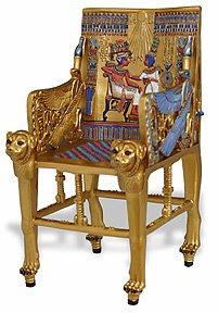
These chairs are closer to a throne for high class people in the Egyptian society. It was often ornamented with gold and precious stones. Most Egyptian furniture has an illustration of a story a myth or a king or queen depicted on the back rest. The throne was a symbol of authority and prestige in Egyptian society.
Known as the “Cathedra” the Bishop’s Chair is a symbol of teaching authority in the Roman Catholic Church and the Orthodox Church. A famous example of a Cathedra can be the Triumph of the cathedra Petri. This was designed by Gian Lorenzo Bernini in 1657.
This chair was designed by Marcel Breuer in 1925 and was heavily influenced by the Bauhaus movement. At this time the chair was revolutionary because of the application of materials and the manufacturing methods.
This chair was designed by Verner Panton in 1967. It was famous for its beautiful form and bold colors however, it was mostly known for its revolutionary production methods. It was revolutionary at this time, because it was the first chair made out of a single piece of plastic.
As technology advanced, today, office chairs are ergonomically designed for people who spend hours sitting in the office environment. All parts are adjustable to the various shapes of human body. Instead of cushioned seats, meshed canvas is popular in the market because it prevents sweat occurring from sitting for a long time.